When Color Isn't Just Color: The Hidden Conversation Between Shopper and Display
If you’re sourcing metal display fixtures for a retail rollout, you’re comparing specs, costs, material durability, and lead times. But there’s one factor your end customers notice before any product interaction—color.
Color plays a measurable role in stopping foot traffic and capturing attention. According to behavioral research, up to 90% of initial product judgment is based on color. This isn’t just psychology—it’s sales science.
That makes color a commercial tool. For procurement professionals, integrating color strategy into retail fixture sourcing helps maximize sell-through while minimizing visual noise.
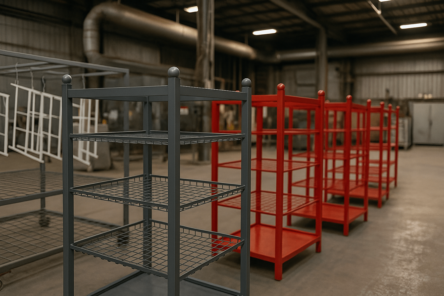
We engineer custom retail display fixtures with finish, substrate, and color tailored to each category, lighting condition, and shopper segment. Whether you’re sourcing matte black powder-coated steel for tech, brushed bronze for beverage, or soft white for cosmetics—we ensure consistency, scalability, and production feasibility.
To support global procurement efficiency, our team offers early-stage RAL color matching, CAD-based finish recommendations, and production-ready prototyping—all aligned to your brand and region-specific compliance.
The Neuro-Affective Mechanics: How Color Primes Shopper Behavior
Color triggers emotion before logic, influencing decisions within seconds. A shopper walking past your fixture isn’t evaluating features—they’re reacting to mood, energy, and subconscious signals.
Color Emotion Mapping
| Color | Emotion Triggered | Ideal Application |
|---|---|---|
| Red / Orange | Energy, urgency | Clearance, impulse buys |
| Blue / Navy | Trust, calm | Health, tech, premium items |
| Green / Earth tones | Sustainability, freshness | Organics, food, pet supplies |
In metal POS display color standards, surface finish impacts vibrancy. Brushed aluminum mutes tones, while powder coatings enhance uniformity.
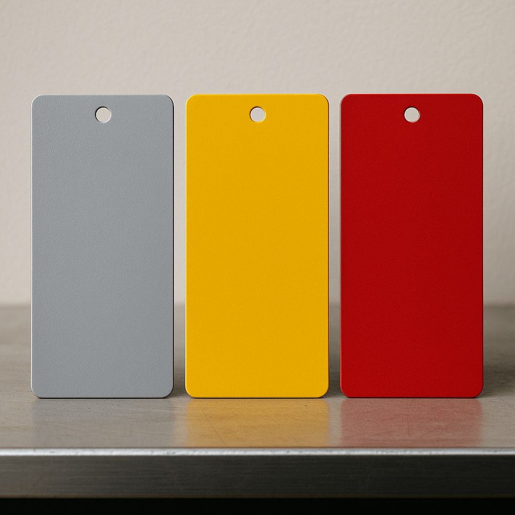
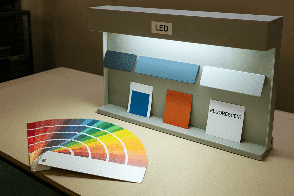
Our team conducts lighting-verified prototypes, testing selected RAL codes under both warm LED and daylight conditions to ensure accurate color output.
Shopper Profiles and Color Sensitivity: Matching Displays to Buying Behavior
Different shopper personas interpret colors uniquely. Understanding this can dramatically improve fixture effectiveness at the point of sale.
Shopper Type–Driven Color Tactics
▶ Impulse Buyers
Drawn to strong contrasts and saturated hues
Effective finishes: gloss red, vivid yellow, metallic chrome
Applications: convenience aisles, seasonal offers
Procurement tip: Use high-contrast finishes and frequent changeovers to boost short-term lift
▶ Rational Evaluators
Prefer clean, trustworthy visuals
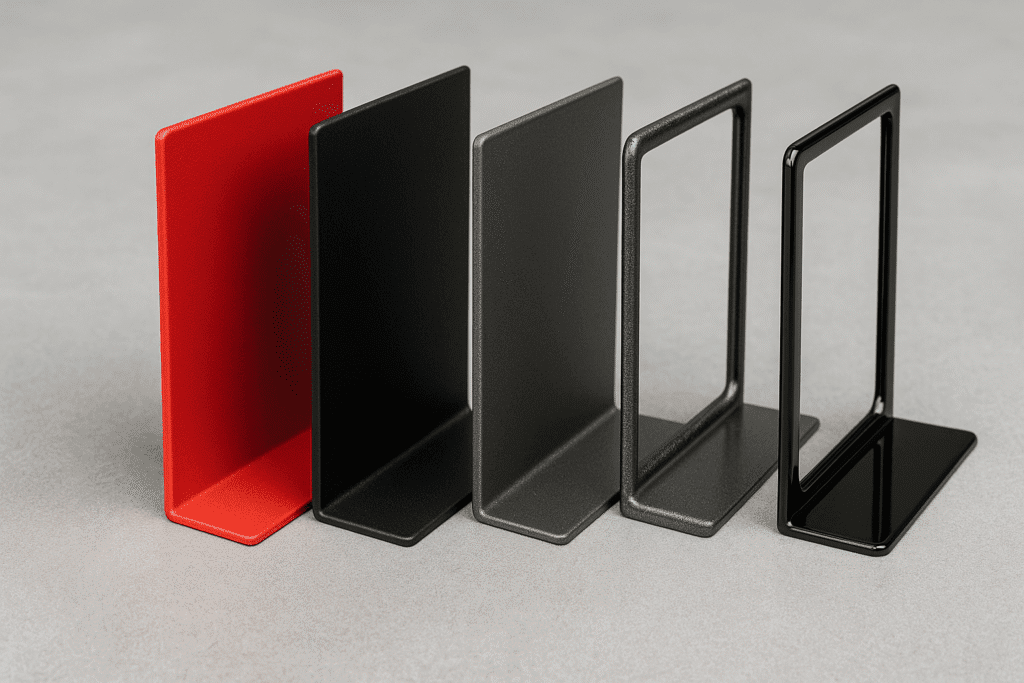
Effective finishes: matte black, steel blue, charcoal
Applications: electronics, automotive, tools
Procurement tip: Stick to stable, brand-aligned tones with long lifecycle ROI
▶ Trend-Driven Consumers
Notice fine texture, gradient tones, and subtle warmth
Effective finishes: brushed bronze, pastel coatings
Applications: lifestyle, beauty, apparel displays
Procurement tip: Choose modular panels with seasonal coating flexibility
With our modular systems, buyers can localize finish sets without full retooling—preserving budget while enabling visual adaptation.
Aligning Brand Identity with Display Color Strategy
A disjointed color scheme can dilute even the strongest brand. Store-level displays must mirror the visual essence that marketing invests in.
For example:
A sustainable brand might prioritize matte greens or textured earth tones
A luxury electronics label might require anodized black or deep metallic finishes
A youth fashion retailer may opt for gradient tones or semi-gloss overlays
We work closely with procurement and brand leads to turn mood boards and color swatches into RAL-coded, substrate-specific outputs—matched to metal fabrication feasibility.
Adapting Display Colors to Regional Market Preferences
Color perception varies across regions. Smart procurement planning considers cultural expectations:
| Region | Color Preference | Application Notes |
| North America | Neutrals, navy, steel grey | Preferred in tech, tools, general retail |
| Europe | Cool minimalism, whites | Seen as premium and modern |
| MENA | Deep reds, metallic golds | Linked to tradition and luxury |
| East Asia | White, silver, auspicious red | Aligns with formality, celebration |
For wholesale RAL color sampling for metal displays in export markets, our team supports global buyers with regionally-tuned finishes and full compliance documentation.
Sample Validation: How to Avoid Color Discrepancies in Bulk Orders
Color mismatches in bulk display orders often result from lighting differences, substrate variation, or inconsistent coating specs.
Risk Factors:
Coating thickness and curing variance
Steel vs. aluminum reflectivity
Warm vs. cool store lighting conditions
Our Solution:
We mitigate these risks through mockup kits that replicate store environments, paired with precise documentation and batch sample controls. Our validation process ensures every shipment maintains approved finish consistency.
If you’re procuring RAL-matched powder-coated displays for export markets, our pre-production testing helps avoid downstream production surprises.
Frequently Asked Questions (FAQ)
Q1: What is the best coating for retail display durability?
A: Powder-coated steel is industry-standard due to abrasion resistance and visual uniformity. We offer UV-resistant and anti-fingerprint options as well.
Q2: Can I request RAL samples before bulk ordering?
A: Yes. We provide RAL-matched prototypes under simulated lighting for pre-approval.
Q3: How do you ensure color consistency in high-volume orders?
A: Through controlled curing protocols, batch sampling, and pre-production testing across materials.
Q4: Do you support region-specific color adaptation?
A: Absolutely. We advise on color psychology and compliance by region, providing targeted finish sets.
Q5: What file formats do you accept for CAD finish specification?
A: We work with STEP, DWG, and PDF specs, and return annotated samples with finish confirmation.
Q6: What’s the difference between RAL and Pantone for display production?
A: RAL is preferred for industrial coatings like powder-coated metal due to global standardization. Pantone is more common for packaging and print. We can convert between both upon request.
Q7: Can you help simulate lighting impact on color for our retail environment?
A: Yes. We replicate your store’s lighting conditions in pre-production samples to ensure accurate in-store appearance.
Would you like support selecting the optimal color + finish for your metal retail displays? Submit your specs to receive a region-specific finish matrix, RAL sampling kit, and lighting calibration proposal for your cate